Yoga & Martial Arts Fusion
There were many firsts this year, including our first yoga logo! However, this is not your typical yoga brand.
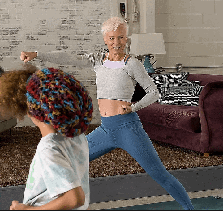
YogaMA is the brainchild of Sandy Weatherall, a certified yoga instructor and a black belt in karate. Sandy saw a gap in the fitness industry for youth, which was the inspiration for YogaMA.
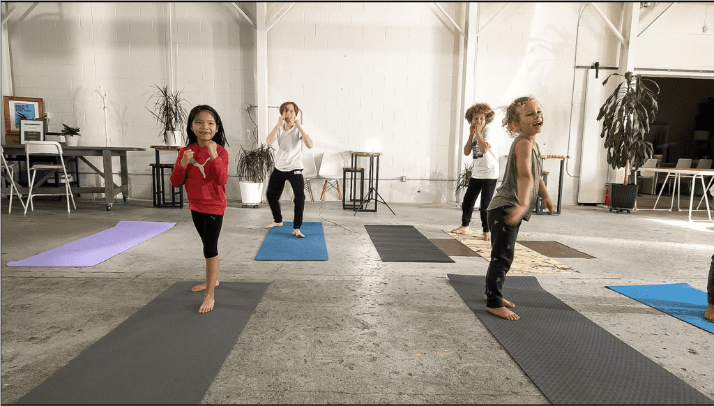
It is a unique fitness fusion of martial arts and yoga. A YogaMA session will cycle through high-intensity cardio and low-intensity, low-impact yoga.
The combination helps with not only fitness but with mindfulness. Seeing more children with monkey brain, Sandy wanted to create something that was accessible for all incomes and all skill levels. The COVID-19 pandemic also increased everyone’s screen time!
Brand Identity Objectives
Create a friendly brand that inspires kids and parents alike to get moving!
Target Audience
The YogaMA brand is for kids 9-15 years old. These kids are wanting to move more and get involved but they may be self-conscious. Other barriers include not knowing what they like, or their parents may have financial restrictions.
Brand Research
In our research, we learned that kids are active because their parents are active. While we needed to keep the kids in mind in our branding, it was also important to create something that would resonate with the parents. It couldn’t be too childlike because the best way to get kids into sports is to get their parents involved, too. 

We discovered that one of the barriers to entry into sports is cost. There is a sharp decline in sports participation in households making less than 100k a year,
Another barrier is the lack of knowledge or understanding of the sport, and having an idea of who the sport is “for”. Yoga in particular has a stigma around it that it is for middle and upper-middle-class caucasian women. We knew we would need to break down these barriers in the branding.
Design Solutions & Yoga Logo
Using organic shapes we overlapped a calming blue (representing the flow and peace of yoga) with a vibrant yellow (representing the high energy of martial arts) to create a grounded green.
This flowing fusion of colour and shape reminds us to center ourselves. The YogaMA font is a little bit playful and a lot down-to-earth with its handwritten style. While avoiding looking childlike, this fantastic font lets you know that this isn’t the place to take yourself too seriously.
Want to Create More Flow with Your Brand?
If you feel like your brand is swimming against the current then it’s time to give us a shout!
