Bold and colourful
BRAND COLOUR CODES
YOU MIGHT BE HERE IF…
…your logo changes colour when you upload it to Facebook.
…you want to know what all those letters and numbers mean.
…you are struggling to match your colours.
Colour is like an iceberg. Most people only see a tiny portion of it on the surface, but if you ever have to plumb the depths of colour it can get really confusing. People ask us a lot of questions about how to get the most out of their brand colours – and that’s a good thing! Having consistency in your brand colours can make a massive difference to visibility and client recognition. For example, most consumers can easily identify Coca-Cola red, and that’s exactly what Coca-Cola wants!
If you’re on this page, it’s probably because you’re looking at your brand framework or your logo files and thinking, “I don’t have a foggy clue where to start.” Here are some in-depth descriptions of the colour spaces and when, where, and how to use them!
First of all, what is a “colour space?” Colour space is a jargon-y designer term that describes a way to map or identify colour. When you’re creating something new (like a website) and you’re trying to match the colours exactly to your brand colours, you can use these mapping tools to make sure you get the exact shade – not just a similar one!
There are lots of colour spaces, both digital and physical. I’ll be digging into the 4 most common ones for graphic design, web design, and branding.

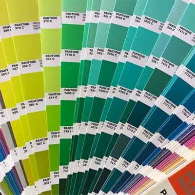
Pantone Swatch books are used by designers for colour accuracy. They can be used to show clients the true-to-life colour instead of what’s on screen, which may not print as it is viewed.
Pantone
The Pantone Matching System (or PMS) is the king of colour spaces. Pantone is a company that essentially has a monopoly on colour-matching worldwide. Pantone 375C (or Paper Lime Creative green!) is the same shade of lime green across the globe. Pantone’s high level of accuracy has made them a leader in colour. You may have looked through one of their swatch books when working with your designer.
Printers use Pantone swatch books to match your brand colours perfectly. Because Pantone is easiest to match (and all other colour spaces can be derived from it) we consider it the “King of Colour!” If you grab nothing else from your designer, make sure you grab the Pantone number. Other colour spaces can be converted from Pantone colours here.
When should you use it? Use Pantone when colour accuracy is more important to you than the cost of printing. Printing in Pantone can be expensive, but if having that immediate recognition (like Coca Cola) is a priority, then printing in Pantone will be worth it for you.
CMYK
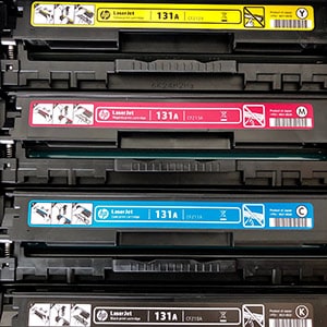
As print designers, we use the CMYK colour space 90% of the time here at Paper Lime Creative. CMYK stands for cyan, magenta, yellow, and key (Key is black, but it was called “key” because black was used as the key colour for alignment). Your home or office printer runs off these four ink or toner colours. If you look really closely at a magazine, you’ll see that it’s made up of tiny dots in these colours.
CMYK is used as a cost-saver. Printing in Pantone requires a special printer with special plates, which can be costly. If you’re using any photography, it’s downright cost-prohibitive to be printing in Pantones.
Day-to-day printing is done with a digital printer using CMYK – this includes your printing at Staples or your corner print shops like UPS or Minuteman. Digital printing is slowly improving to match Pantone colours so it can provide the brand accuracy you’re after. However, there can still be colour discrepancies. Talk to your printer or designer about colour matching and your best options before you go to print!

Your printer will use CMYK inks.

RGB colours are created by mixing light, instead of a physical medium like ink or paint.
RGB & Hexadecimal
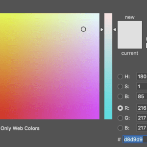
RGB stands for red, green, and blue. When you layer different levels of red, green, and blue light, it can create different colours. Because RGB is dealing with light, it’s the colour space used for digital screens. Hexadecimal is a six-digit code used for screen colours on websites only.
Here are a couple of important items to note for RGB:
• The colours available in RGB can be more vibrant than CMYK.
Does anyone remember MS Paint? There were super vibrant neon colours at the bottom. Those are great examples of RGB colours that don’t translate easily to print. Again, it’s essential to start with Pantone and derive other colours from the Pantone to make sure you have accuracy across platforms. That way, what you see can truly be what you get.
• RGB is device-dependent
Every screen is programmed a little differently. The way you view a specific RGB value on your computer may vary from how it appears on your phone or your co-worker’s screen. If it’s important to you, you can look into colour management for your own system to get accuracy between your computer and scanner/printer, but unfortunately, you can’t control how your branding is viewed on other people’s screens.
When should you use it? Any time you’re doing something online. If you’re uploading your logo to Facebook, the RGB logo is the one you’re looking for! You may have seen CMYK logos uploaded to Facebook in the past, and they will not look right. You’ll just know. They’ll be all neon and glowing, and just look plain weird.
