Elevating Your Edmonton Branding
Although there are many important elements in a brand, one that people often overlook is a brand’s custom fonts. Fonts are all around us, whether we consciously take notice or not. Different styles invoke different emotions. Thin curly scripts give an air of elegance, while chunky, thick stems look bold.
To help you picture the difference a font can make, think about the covers of your favourite books or the posters for movies you’ve seen recently, or even the packaging on your favourite products. The leading products in every industry have great design and brand development. Behind those products are branding agencies that made conscious decisions on which colours and fonts will grab your attention.
Why Do You Want to Choose Fonts for Your Brand?
No matter whether you are creating a digital marketing campaign or preparing for print design, you’ll need to select at least two fonts for your brand. You’ll want to be intentional, just as you are with your logo. It’s not just about making your brand look attractive; it’s about reaching your ideal customers and giving them the feeling they’re seeking.
You aren’t expected to know the nuances of the different fonts or how to master the art of font pairings (it can be trickier than pairing wine with your meal!) All you need to know is that your font selection should not be random. A great graphic designer in Edmonton can help guide you to the right decisions when it comes to selecting fonts for your brand.
What Is a Font?
If you’re not a brand designer in Edmonton, you might not know what a font is or why it matters, and that’s okay. All you need to know is that your font is how your words and text look in your print and digital branding. Choosing your brand fonts gives you a visual identity that your customers will recognize.
You’ve probably encountered and used the universal fonts: Verdana, Arial, Times, and Georgia. These fonts are on every computer and device in the world. Beyond the universal fonts, there are many more styles to choose from to match any brand.
 Serif Fonts
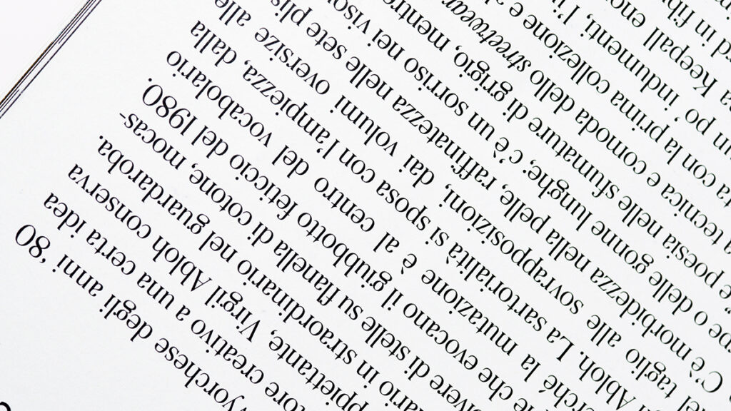
Serif fonts are a style of text that includes serifs, which are the little tags found at the end of the main strokes on each letter. Serif fonts are traditional print fonts. The decorative tags make it easier to read large blocks of text in print form.
Sans-Serif Fonts
The sans-serif fonts are styles of text that do not have decorative tags. Sans-serif fonts work well as headings as well as for large blocks of text on digital screens.
Script or Display Fonts
Display fonts or script fonts are highly decorative and often look like handwriting or calligraphy. They are more challenging to read in large blocks of text, which is why they are considered display fonts.
The Power of Brand Fonts
Fonts are powerful, which is why we recommend using at least two main fonts for your brand. You can select three, but only if you use them wisely. The primary rule is that you should never choose two fonts from the same category. Fonts work best when there is contrast. Choosing two serif fonts or two non-serif fonts will cause them to clash and get lost against each other. In contrast, two display or script fonts will often look messy.
We recommend the following safe font combinations:

- 1 Serif Font + 1 Sans-Serif Font
- 1 Serif Font + 1 Script or Display Font
- 1 Script or Display Font + 1 Sans-Serif Font
When and How to Use Your Brand Fonts
Once you have your brand fonts, you’ll probably wonder how to use them. A branding specialist or graphic designer will give you all the details and instructions on how best to use all your brand assets, but there are basic guidelines for using your fonts. When writing anything from digital content to print materials, one of your fonts will be used in the headings or call-out sections, while the other font will be used for the main content sections. This helps bring interest to your material and draws attention to your heading sections.
A Note About Credibility and Fonts
Another reason to consult a branding expert when choosing the fonts to represent your company is to help you avoid the common mistakes that often hurt the credibility of the companies that make them. For example, a professional legal or financial firm that chooses to use a font that appears comical or well-suited to a child’s birthday party invitation will appear less credible than if they used a strong and confident serif font.
Understanding Your Brand’s Personality and Values
Knowing how powerful fonts are and the different categories of fonts is a great start, but before you can select your brand fonts, you need to be crystal clear on your brand’s personality and values. What does your company stand for? How do you want to be represented in the world?
Fonts can be fun, formal, elegant, professional, and even wild. You’ll need to pick the ones that match your company. A branding expert can help you understand your brand, solidify a brand story, and select the best fonts to go with your brand package.
Collaborative Font Selection Process
At Paper Lime Creative, we follow a collaborative creative process. We’ll help you find fonts that match your brand and also help you select the fonts that fit your budget. Some fonts are universal, others are free, while others come with a price tag—though it often makes them less common, helping your brand stand out more.
Once you have your chosen fonts, we’ll send you QR Codes so you can easily download your fonts at your convenience and share them with your marketing team.
Your Edmonton Graphic Designer and Brand Specialist
When you need a complete brand package, including brand fonts and logo design in Edmonton, Paper Lime Creative is your go-to collaborative agency for graphic design. Edmonton is full of incredible small businesses and inspiring entrepreneurs and we’ve had the joy of working with many of them. We look forward to working with you next! Contact us to learn more about fonts, graphic design, and branding in Edmonton.
