Creating documents that are easy to read is so important. It doesn’t matter how great the content is if it’s difficult for someone to read — especially large volumes of content like a book or document.
I chose to do this post in September with the hope to educate teachers, but the following tips and tricks will be great for anyone who wants to DIY some marketing materials, or has to make a decision on some design work. This will give you an understanding of some design concepts so you can communicate to your designer better and be able to verbalize what you’re actually seeing.
Font Choice
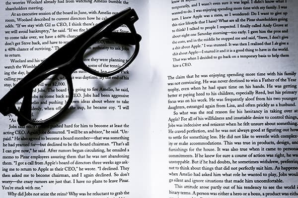
The easiest and most common way to change readability is changing the font. Display fonts are decorative and can be a lot of fun, but are hard to read. Examples of this would be Comic Sans, Jokerman, Papyrus, Giddyup, and more. It’s best for large volumes of text to go for something simpler. Clean lines, straight angles and minimal flourishes.
Serif fonts (the ones with tiny feet) are often used in novels because those tiny feet create a baseline that helps your eye follow along. Serifs don’t translate well on screen, so often you will see websites in sans serif fonts (without the feet). I could write a whole blog post on picking fonts (and maybe I will) but if you’re concerned about readability, the simpler the better.
Here are some ones you can use if you’re unsure!
Sans Serif: Helvetica, Arial, Gotham, Avenir
Serif: Times New Roman, Garamond, Georgia, Baskerville
Font Size
Probably the next easiest way to change readability is font size. Every font varies in its default size. 12pt font will not be the same height across every font, it depends on how the font designer programs it. The 12pt default on Word (either Calibri or Times New Roman) is actually very large for blocks of type. It can be a great size for postcards or business cards, but novels are often in the 9-11pt range. Bigger does not always mean easier. It depends on how physically close the reader will be to the content and what is around it. Sometimes if something is hard to read, instead of making it bigger put more space around it.
Colour
Everyone loves playing with colour! Picking the right colour can drastically affect readability. Some people can’t read red markers on whiteboards, which is a perfect example. Red can be a tough one. More contrast is generally a good practice for easy reading, but too much contrast can be tough on our eyes. Yellow and black can be jarring. Even black on white can be too much and recently, especially with so many people reading on screens, we’ve moved to dark grey text and/or off-white backgrounds. While it can look cool, light text on dark backgrounds is harder to read than dark text on light backgrounds.
These next couple are a bit jargon-y but make a huge difference in design and can be great to know when you’re communicating with a designer
Leading
Leading (pronounced led-ing) is the space between letters. For example, single vs double spacing on Word. Designers can set the leading to a specific point size. For 12pt font, 12pt leading would be single, 24pt would be double, but we can do anything and everything in between. With some fiddling, you can do it in Word as well.
How do you know if you have appropriate leading? Unless you need the space to write edits or corrections for a paper, the best practice is to aim for a medium grey box. Print out a sample, put yourself 6 feet away and squint. It should look like a medium grey box. If it’s looking more black, the text is too close, if it’s looking more white, it’s too far apart.
Tracking
Tracking is the overall space between letters. For example, the eBay logo has tight tracking. The letters are touching. Avon and Gucci brands, however, have much wider spacing between the letters. Making a choice one way or another can affect a brand. Often logos with wide spacing seem more luxurious because they can take up space.
However, with large volumes of text and making content easier to read, tracking should follow the same rule as leading. The goal is a medium grey box. Make the spacing wider or thinner until you hit the sweet spot.
Bonus Tip!
Whether it’s a textbook or a website, don’t be afraid to break up the text. Line lengths are ideal at about 7 words. Use page breaks, lines, photos and more to create friendly chunks.
Want things to be nice and easy?
Do you ever look at a page of text and go “nope!”. What do you do when faced with a ton of information? It might be time to call in the professionals! Book a consultation call with us today to chat about that next big project on your list.