Bold and colourful
GRAPHIC DESIGN TERMS
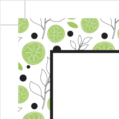
The ticks in the top left corner are crop marks, this is where a print document will be trimmed. The excess design is the bleed. This ensures that your document prints edge to edge.This is a VERY pixelated image of a coffee mug, but it illustrates how images are made up of individual squares.
A
AI: AI stands for Adobe Illustrator and is a proprietary file format to the Adobe Creative Suite. AI files are typically vector graphics (look for .ai at the end of your file name).
Alignment: Alignment is one of the principles of design and refers to lining up tops, bottoms, or sides of different elements. If you’re doing DIY design, pay attention to alignment – it will elevate your brand and make it look professional.
B
Body Copy: Body copy is the main content of a book, magazine, web page, brochure, etc. Body copy does not include headers, titles, subtitles, or captions.
Bleed: Bleed is a term used for printed materials in instances where a graphic or images meets the edge of the printed page. An excess is printed to ensure that there is colour from edge to edge after trimming. Think about this like the crease in a book or magazine. When a designer doesn’t leave room for bleed, the words are cut off by the binding.
Branding: Your brand is much more than a logo, a colour scheme, or a design. It’s the beating heart of your business. It represents the incredible lasting relationships you have with your clients.
C
CMYK: Stands for cyan, magenta, yellow & key (black). This is the color space used for digital printing. Home printers usually use CMYK.
Colour Space: A colour space is a way we organize and define colours. There are many different colour spaces, including CMYK, RGB, and hexadecimal.
Crop Marks: These are those funny lines you’ll see in the corners of your artwork when you’re having materials printed and cut. Printers use crop marks to know where to trim your print materials. Very few printers can print right to the edge, so excess (bleed) is printed with crop marks to indicate where to cut. Then the excess is trimmed off to ensure colour from edge to edge.
D
Digital Printing: Unlike offset printing, digital printing does not require plates to be made. Ink is distributed in a dot pattern. Digital printing is cheaper for smaller print jobs, and colours are getting more and more accurate.
DPI: Stands for Dots per Inch. It’s not to be confused with its close relative, PPI (pixels per inch). DPI describes the number of dots a printer can print in a given space.
E
EPS: Stands for Encapsulated Post Script. This is the most common and easy-to-use vector file (look for .eps at the end of your file name).
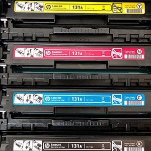
Your printer will use CMYK inks.
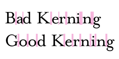
Kerning is the space between two letters. Once you see it, you can’t unseen it! Sorry not sorry.
H
Hexadecimal: Hex codes are the format for web colours. These six alphanumeric codes program your brand colours on your website so you can get an exact match.
J
JPEG: A common raster file format, JPEGs are easy to use and allow a balance between file size and image quality (look for .jpeg at the end of your file name).
K
Kerning: The space between two letters, which can be adjusted to create easier to read text or visually interesting designs.
L
Leading: Leading is the space between two lines of text. In your word processor, you may be familiar with 1, 1.5, or double-spaced formats. In design, we can customize the spacing even more precisely to help with legibility and create visually appealing layouts.
Legibility: Legibility describes the ability for a reader to distinguish individual characters and lines of text. Highly legible texts are easy to read. Illegible texts are not easy to read.
M
Margins: A margin is the space or border between design elements or text and the edge of the paper.
O
Offset Printing: Offset printing is a printing method using plates that are rolled onto the paper or substrate (think of how newspapers are printed). The benefits of printing offset include high colour accuracy and specialty inks (like metallic!). Plus, it’s actually cheaper at high volumes (think newspaper volume).
P
Pantone or PMS: Pantone is a company known for its proprietary colour matching system. Pantone colours are accurate across the globe and across a variety of industries, which makes them appealing for brand consistency and recognition.
Pixel: A single point of a raster image. The number of pixels in an image determines its resolution.
Pixelated: Pixelation occurs when there are too few pixels for a given size of an image. As you increase the dimensions of a photo, the computer is forced to make up information that isn’t there to fill in the gaps, which gives it a pixelated or blurry look.
PDF: PDF Stands for Portable Document Format. It’s a common file type that supports both vector and raster graphics. PDFs are ideal for print files to send to your printer, and they can also be created as fillable web documents (look for .pdf at the end of your file name).
PNG: PNG stands for Portable Network Graphics. PNG is a useful graphic type for web design because of its small file size and transparency options (look for .png at the end of your file name).
PPI: PPI or Pixels Per Inch describes the resolution of a digital photo. Ideal PPI for screens and web is 72 PPI. For print materials, the ideal is 300 PPI. If you’re unsure about the pixels per inch of a photo, the file size is a good indicator. If an image is measured in kilobytes (KB), it’s a lower resolution photo. If it’s measured in megabytes or gigabytes, it will be a higher resolution photo.
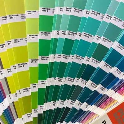
Pantone Swatch books are used by designers for colour accuracy. They can be used to show clients the true-to-life colour instead of what’s on screen, which may not print as it is viewed.
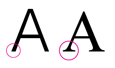
Serif fonts have little feet at the end of them, where as sans serif fonts do not
R
Raster: A raster image is made up of tiny squares called pixels. All JPEGs and PNGs are raster files and photographs are always raster files.
Readability: Not to be confused with legibility, readability describes how much a viewer wants to read something. Graphics can be readable, but not legible (i.e. street art or graffiti looks cool and draws the eye, but it can be hard to read the message).
Resolution: Image resolution describes the amount of detail in (usually) a raster image. The higher the resolution, the greater amount of detail and the larger the file size. Resolution is often described in PPI (Pixels per Inch).
RGB: RGB is a colour space used to measure and describe colours used for digital screens. This could be on your computer, television, phone, or digital camera. It stands for red, green, blue.
S
Sans Serif Font: A font without a small line (or “foot”) at the end of each stroke.
Script Font: Script fonts are based off the fluid strokes of handwriting. There are many styles of script fonts, from traditional calligraphy to more modern bouncy letters.
Serif Font: A font with a small line or foot at the end of each stroke. The serif (or foot) creates a baseline that makes it easier to read. Popular serif fonts include Times New Roman, Cambria, and Garamond.
T
TIFF: TIFF stands for Tagged Image File Format. These are raster image files that typically have high resolution, so they’re a preferred file format for print designers and digital artists.
Typesetting: Typesetting is the composition of type for print material. Typesetting ensures the most important message gets to the reader ,and the content is easy to read and understand.
Typography: Typography is the practice of arranging type to make content readable, legible, and overall good-looking!
V
Vector: Vectors are graphics built based on points and curves instead of pixels. Vectors, unlike raster images, can be scaled to any size.
W
White Space: White space (or negative space) refers to the areas of the page, webpage, or design that are left unmarked. Keeping a balance between white space and content is important in graphic design.
