Feeling Green with Envy?
Today we are talking about green logos! No, not eco-friendly logos (we’ll save that for another blog post), but instead we’re talking about logos and brands that use green as their predominant colour. We are partial to a particular shade of green ourselves!
The Psychology of Green Logos
First, let’s start with the psychology behind the colour green. Picking the right shade or tint of any colour is important, as they all have slightly different connotations. Green as a whole represents growth and nature because it is the colour of plants, trees, and grass. Green represents money and finance because it’s the colour of money (unless you’re like us in Canada with multi-coloured money!) Green also represents envy and jealousy (you can be green with envy). Did you know that green is one of the most relaxing colours? It’s the easiest for our brains to process, which is why celebrities relax in literally green rooms before doing an interview.
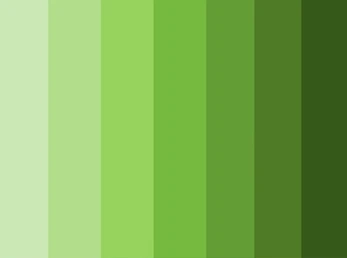
Yellow greens (like the one we use at Paper Lime Creative), pull connotations and emotions from the colour yellow; emotions like positivity and energy. This is a great choice if you want to marry energy with relaxation, or a concept of nature but without the weight of a dark green logo. Yellow greens would include lime green, grass green, chartreuse, and olive.
Blue greens pull connotations from blue; emotions like calm, peace, or professionalism. These shades are a great choice if you want to appear more professional with your logo design, but still want the symbolism that comes with green. Blue greens include hues like emerald, forest green, hunter green, seafoam green and mint.
Picking the right hue for your green logo is important because the right colour can be a powerful communication tool. There are an infinite number of colours to choose from and slight variances can change the meaning to exactly what you want to tell your client or invoke a certain emotion that you want them to feel.
Famous Green Logos
There are a lot of famous brands that use the colour green. The first one that comes to our mind is John Deere. Their shade of green is iconic in the agricultural industry, and the specific shade they use comes directly from the colour of growing crops (same with the yellow they use too!)
Starbucks, of course, uses green as well. It is an homage to the green aprons brought on in 1987 as the company started to expand. The green also represents their efforts to work with farmers and to ethically source their coffee.
Whole Foods has a green logo. This makes sense for a brand that prides itself on organic, plant-based, non-GMO options for its patrons. Its mission is to support and advance environmental stewardship in everything they do, and having a green logo represents that perfectly.
When you’re selecting colours for your brand, it’s important to keep your target audience in mind. How will they react to this shade of green? Are there any generational or cultural connotations to the colour? For example, in South America green symbolizes death. If you are targeting a demographic that would encompass a lot of people from South America, and your product doesn’t have anything to do with end-of-life, green might not be the best choice!
Want Your Own Green Logo?
We love having a green logo at Paper Lime Creative. It represents our fresh ideas, and the positivity we strive to bring to our clients’ lives. What do you think of the colour green? If you think a green logo is in the cards for you, give us a shout!