Bold and colourful
LOGO FILE TYPES
YOU MIGHT BE HERE IF…
… you’re wondering where your logo background is.
… your logo is appearing blurry.
… someone is asking for a specific file type and you don’t know which one to send!
You may have thought your logo was one cool graphic that you wouldn’t have to think too much about. Then you received your brand package with 40 different file types. Now you’re confused. It’s okay. You’re going to be okay.
Our first recommendation is don’t delete anything. There will probably be files you won’t be able to open on your computer but be sure to keep them; other people you’ll be talking to in the future will need them. That may include graphic designers, web designers, and promotional product companies. They’ll need specific files provided to you in your branding package, so be sure to hang on to everything!
Now, let’s get to the reason you’re here – what the heck is in your logo package?
Image files, graphics, logos, pictures, etc., can be broken down into two big categories: raster and vector. Most people are incredibly familiar with raster images – whether they know it or not – so that’s where we’ll start!

This is a VERY pixelated image of a coffee mug, but it illustrates how images are made up of individual squares.
Pantone
The Pantone Matching System (or PMS) is the king of colour spaces. Pantone is a company that essentially has a monopoly on colour-matching worldwide. Pantone 375C (or Paper Lime Creative green!) is the same shade of lime green across the globe. Pantone’s high level of accuracy has made them a leader in colour. You may have looked through one of their swatch books when working with your designer.
Printers use Pantone swatch books to match your brand colours perfectly. Because Pantone is easiest to match (and all other colour spaces can be derived from it) we consider it the “King of Colour!” If you grab nothing else from your designer, make sure you grab the Pantone number. Other colour spaces can be converted from Pantone colours on the Pantone website.
When should you use it? Use Pantone when colour accuracy is more important to you than the cost of printing. Printing in Pantone can be expensive, but if having that immediate recognition (like Coca Cola) is a priority, then printing in Pantone will be worth it for you.
Vector
Vector images are usually those ones you can’t open on your computer. Vector files are very common in the design and branding world because they’re so usable – you can create any file type easily from a vector (even JPEGs and PNGs). Unfortunately, it’s not as easy to go the other way and create a vector from a raster.
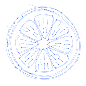
The difference between a vector and a raster is in how it’s built. While a raster is built with pixels, a vector is built mathematically using points and curves. This is super cool because it means a vector can be scaled to ANY SIZE without loss of quality. You want to make sure you have a vector file of your logo so it can be 2 inches wide on your business card or 20 feet wide on a billboard.
What are the most common vector file types? EPS, AI, PDF
EPS: We’re starting with EPS files because they’re the most universal vector files. They are compatible with all types of software. They are editable and resizable, and all file types can be made from an EPS. Be sure to get one from your designer! (A Pantone EPS is ideal).
AI: AI stands for Adobe Illustrator. An AI file is an Adobe proprietary file type. These are common file types because of the popularity of the Adobe Creative Cloud, a software used by graphic designers. It’s a great file to have, but because it’s Adobe specific, it may not work on other graphic editing software.
PDF: Good ol’ PDFs. Did you know that they can be vector graphics? We’re so used to downloading forms and documents in PDF format, we forget what the true capabilities are. Getting a PDF of your logo is handy because it’s a file that most people can open, but it’s still usable!

This is what designers see when we build logo files. Vectors are built with points and curves instead of pixels.

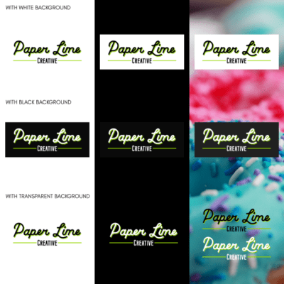
We always give out transparent logo files. We don’t give logos with backgrounds unless specifically asked, because we want your files to be as flexible for you as possible!
File Transparency
People often ask us about logos and background colours. Clients often want their white logo on a black background. We only provide these file types when they’re specifically requested.
However, we do provide you completely transparent files (except for the JPEG – see above) for versatility.
Having transparent backgrounds allows for the most versatility. Here are a few items to think about:
• What if you don’t like the background colour we’ve saved? What if you want grey or green instead of black?
• The shape and size of the background might not work in all situations. What if we put your logo against a square background but you need to fit it onto a rectangular card?
• Matching shades of black is almost impossible in the print world. If you have a small black background around your logo and add more black around it, chances are you will see a distinctive box around your logo. Which leads to the next point…
• Having a big ol’ box around your logo looks unprofessional. If a background is crowded or dark, we always provide a white logo to use instead. That gives you more range for different situations.
