We love working with peers in our industry, so we were very excited when we got to develop a public relations logo for bSocial Communications. Sonia deFazio is the founder of bSocial Communication. Sonia has a background in writing and public relations and started bSocial with the goal of connecting and promoting local business owners in and around Edmonton.
The Client
Sonia is a powerhouse publicist. She worked both for public and private companies before starting her own public relations business. She is a proficient writer that can help business owners with social media, reputation management, content writing and more!
We’ve been fortunate enough to have Sonia both as a client, and also as a collaborator on other projects, like ElementQ!
Sonia is definitely in the right industry because she loves connecting with people and building relationships. In particular, she works with women in the health and wellness space to connect with their dream customers.
The Design of a Public Relations Logo
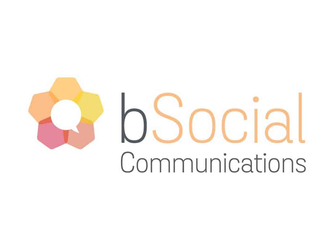
Sonia is the epitome of a community builder. She has a phenomenal community of people around her, and she helps business owners build their own client-focused communities. We took inspiration from bees. Bees are a symbol of community and working cohesively. The hexagons represent a honeycomb but also interlock to make a flower.
Sonia specifically requested that a speech bubble be included in her public relations logo, and making it the centre of the flower was a subtle way to tie all of the elements together.
bSocial has a monochromatic colour palette that includes yellow, orange and red. These colours represent passion, energy, and happiness; all things that Sonia brings to each and every one of her clients.


