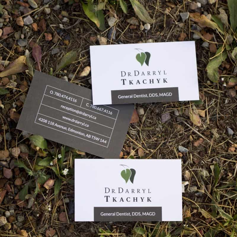
Dentist logos are often riddled with cliches – teeth and toothbrushes. If you want to stand out in your market, it’s important that your logo doesn’t blend in with your competitors. We created a logo that blends the personality of Dr. Darryl, with the familiarity of a typical dentist logo.
The Client
Dr. Darryl is a big outdoorsman, when he’s not doing the dentist thing, he’s a farmer. He also loves hunting and fishing with his kids. We wanted to approach this dentist logo from a different angle and really illustrate how Dr. Darryl is different from his competitors. Patient comfort is key and he only treats one patient at a time. He has a small staff, so you know exactly with whom you are working! Did you know that he has massage chairs at his office so that you’re always comfortable?
Darryl has vast education in many areas of dentistry. This allows him to make informed decisions and consult on the next steps, even for processes or procedures he might refer out like orthodontics.
The Design of the Dentist Logo
Darryl designed and renovated his practice to bring the outdoors inside. Natural wood and stone adorn the waiting area as well as nature-themed art from local artists. We wanted to reflect the calming effect of the outdoors in his branding, while still being a dentist’s logo.
Green is a calming colour and was a natural choice for Dr. Darry’ls logo. The shape of the leaves hints at a tooth without being a blatant cliche that is all too common in the industry.


