Fresh Carpentry & Contracting is known in Edmonton for having the highest standards when it comes to your renovations. If you’re a tradesperson, putting time into your brand shows potential clients your level of professionalism and attention to detail. Creating a high-quality contractor logo is a great place to begin!
The Client
When we met with John, he had very simple parameters; he wanted something timeless and bold. We also knew that we had to meet John’s high standard for quality while capturing his personality. John’s work is clean and elegant, he looks after his client’s homes better than his own. If you want something built to last then Fresh Carpentry & Contracting is the company for you.
Typically for residential renovations, women are the final decision-makers. John is approachable and has a keen eye for design in addition to being a detail-oriented contractor.
The Design of the Contractor Logo
Because contractors typically work with women, creating a contractor logo is a careful balance between masculine and feminine. Typically, company owners want a design that reflects the hands-on blue-collar work that they do. However, this has to be balanced with the client’s wants and needs. Gen-X and Millennial women have grown up watching HGTV and want beautifully designed houses. While they want the job done well, a rough-and-tumble aesthetic is typically not what they are after.
For Fresh Carpentry & Contracting, we went with a clean and elegant wordmark. The colours, while masculine, are still warm and welcoming to female clientele.
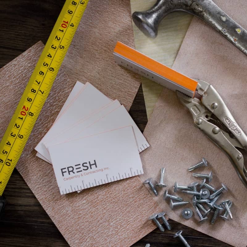
John’s brand also includes a ruler element which is used on a variety of collateral pieces including his business cards, vehicle decals, notebooks and more. This detail reinforces his attention to detail because it is always to scale! It’s also a great conversation starter for his clients and makes his business cards a handy tool (if you need something to measure 3.5″).


