Designing mortgage broker logos is a large part of our clientele. It was hugely refreshing to work with Karen Pacheco, a phenomenal Mortgage Broker in Edmonton. She has a background in home-building, which means she truly understands the home-buying process from start to finish.
The Client
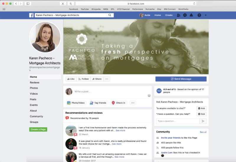
Karen came to us looking for a brand that would represent her. Like many mortgage brokers and Realtors in Alberta, Karen is part of a bigger brokerage, and therefore needs to follow the advertising rules set out by RECA (Real Estate Council of Alberta). Karen is hugely active in her community and because she didn’t have her personal brand, she was putting the brokerage logo on all her volunteering endeavours.
We learned from Karen that a huge part of her clientele is permanent residents whose cultures value hospitality. We knew we would be able to connect to this under-serviced demographic directly by focusing on providing an experience reminiscent of the hospitality industry. Karen was already walking the hospitality walk, but it wasn’t coming across in her visuals and messaging.
The Design
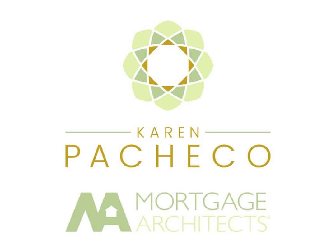
The Karen Pacheco logo is inspired by the cross-section of a pineapple, the international symbol of hospitality.
We didn’t want to create a hokey fruit logo, but rather an abstract professional icon that could be used in a multitude of ways while still letting clients and potential clients know about the experience that they will have.
Of course, we wanted to stay away from the typical mortgage broker logos (a house) and instead create something that reflected Karen’s values and helps her stand out in her market.
Karen’s brand uses two shades of green and goldenrod to create a sense of calm and professionalism.


