Apple, Tiffany and Rolex, what do these high-end brands have in common? White space!
White space, sometimes called negative space, is all the unused area of a print design, document or website. It’s an important component in your graphic design.
White space is a tool that designers use to create focal points, direct the eye, keep things visible and help viewers read all the content. Your brain likes consuming information in chunks. It’s why we add spaces between paragraphs in emails (or in this blog, even).
Here are some tips on how to utilize white space effectively in your print design:
White Space Creates Focus
When your logo or product is on a blank canvas, the viewer has no choice but to look at what you’re showcasing! We hear from clients, “make the logo bigger” so often that it’s become a graphic designer’s inside joke.
This can be a white space issue. Clients want their logo more prominent so, make it bigger, right?
Instead, the better solution can be to either move elements away from the logo, giving it more space to be the focus or make the logo smaller, for the same reason.
Making a logo bigger doesn’t work in every case, especially if there’s other content you want the viewer to look at besides your logo! It’s important to think about why you want your logo bigger as well. A huge logo can take away from what you want your customer to be reading.
Think about the action you want your customer to take, make it the focus of your design and give it lots of room to breathe!
Activate Your Design
“Activating your design” is a bit of graphic design jargon that means using white space as a design element. You use white space to create an image. Probably the best-known example of this concept is the two faces and vase.
When it comes to corporate branding, FedEx is known for the arrow between the E and the X. My favourite example of white space in print design is the hidden bear in the Toblerone logo. Toblerone was created in Bern, Switzerland and Bern is the German word for “bear.” 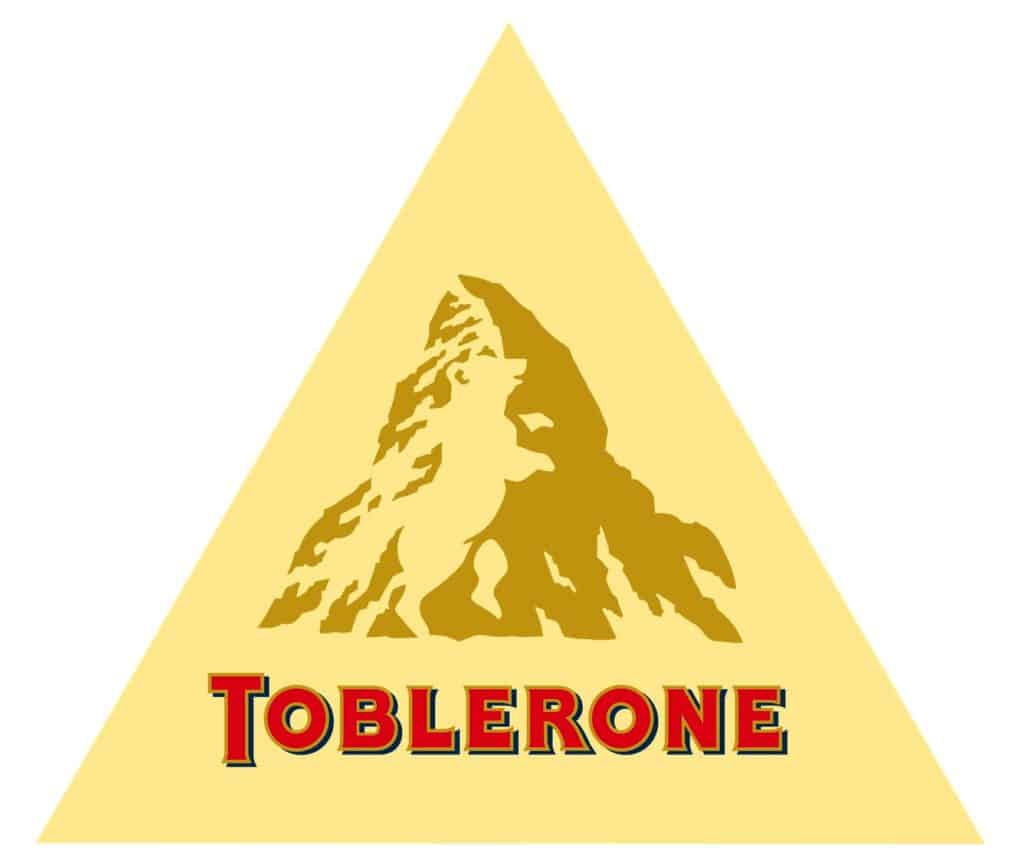
Using negative space consciously as a design element (rather than just the canvas you’re designing on) creates visual interest and is perfect for adding additional meaning to your design. People stare at these designs longer, talk about how clever they are and share them with friends and family!
Luxury Comes from Creating Space
Not only does white space make your content easier to read, but using lots of white space gives the feeling of luxury. If you are targeting a high-end client, creating a luxurious brand is important to help build brand credibility.
Giving a wider spacing to a lightweight letter is an easy way to make your marketing look higher-end. It says “we can afford to waste all this space!” Lots of space makes designs look modern and minimalist.
Check out high-end brands like Apple, Tiffany and Rolex. Their websites and advertising use a ton of negative space to put attention on the product. In addition to lots of negative space, there is no superfluous information on the websites, everything is intentional to put the focus on the product.
White Space Helps With Legibility
 We put content out in the world with the hopes that people will read it. Even the best content can be hard to read when white space isn’t utilized properly.
People need digestible pieces of content or they check out. Think about when you get a wall of text in your email. It seems daunting to read!
You do not want your promotional materials to feel that congested, because your message gets lost. Instead, use ample spacing to help each piece of information stand out. Adding white space strategically can also show readers the order or flow of the content.
Why You Should Avoid Cluttered Designs
Quite frankly, cluttered designs look amateur and cheap. The more you try to cram onto a page, whether it be a print or website design, the more you are telling people that you can’t afford proper marketing materials.
Why can’t you afford proper marketing materials? Is it because you are struggling to sell your product? While this might not be your intention, these are the subconscious cues that cluttered graphic design sends to your potential customers.
If you are unsure how to use white space, it’s important to hire a professional graphic designer. If you are creating cluttered designs, it shows people that you can’t afford to outsource your work, that you have time to do your own marketing (instead of being busy doing what you do best), and that your business isn’t valuable to you.
The more room you can give a design (even if that means making multiple pages on your website or multiple brochures) the more success you will have with each individual piece.
Need More Breathing Space?
Not sure how to get more white space in your print design? Feeling overwhelmed by your marketing and rebranding? Our brand audit can be the perfect solution for you!