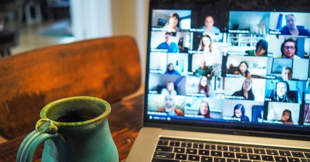
If you’re in North America, it may feel like the pandemic will never end! Even when it does, I think the virtual meeting will be much more commonplace. I don’t think it’s a bad thing. I’ve had meetings with people all over the world at this time that I think would’ve been harder to arrange in a pre-COVID time. I think it would’ve taken more convincing to get the marketer from Australia (17-hour time difference) to meet a stranger in Canada!
Zoom backgrounds have become this interesting piece of branding that I know I had never considered before. What are some Zoom best practices?
Real > Virtual
If you are able to use a real background, do it! While virtual backgrounds can be done well (we’ll get to that in a minute) there’s always a little bit of disassociation with a virtual background. Any technical difficulties that wipe out the whites of your eyes, for example, are not only terrifying but distracting to the person with whom you are speaking. Here are some tips for the best real Zoom background:
- Have your back to a wall and not a big open room. Having your living room or office behind you with books, furniture, pets, etc adds to the distraction
- Have your seat about 2-3 feet from the wall so there is some separation. You don’t want to literally be backed against a wall.
- Add some branding! This is where you get memorable. Art, paint, and vinyl, in whatever combination works for you.
Art
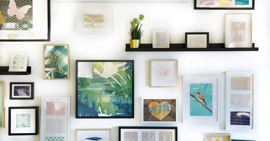
If you’re a creative — show off your own work! Or support local artists. If you can pick a piece that highlights your location or business, even better. I have a vintage colour chart, an Edmonton graphic by local artist Bea Weyland and some street art I got in NYC. I’m going to add a canvas of my brand Pantone, and some of my own embroidery in the coming months. As a creative, I want a big gallery wall behind me. This might seem silly, but people often comment on and remember what art I have behind me. I’ve picked the art with both my business and my ideal customers in mind. Plus it makes me happy in my space
Paint
If you’re in a space that you’re allowed to paint, do it! Just like art, people will remember a splash of colour or some funky wallpaper. Paint your room or a feature wall in a brand colour. At the time of writing this, my walls are taped up and ready to paint dark grey, to go with the bold side of my branding.
Vinyl
You can do some pretty cool stuff with vinyl. The best thing about vinyl is that it’s semi-permanent. Wall decals can last years (there are some factors like how much sun they get, temperature, how you treat the wall, etc that I won’t get into) but can be removed with relative ease when you’re done. Great for rental spaces! Logo, brand values, murals, graphics, etc can all be done in a variety of vinyl that can be just too complex and expensive for paint. Save yourself the taping and buying 5 different colours of paint and get some cool vinyl done.

Virtual
I get it, the COVID-19 pandemic has turned a lot of things upside down. You might be working from a home that was never meant to have a home office. People are making space in basements, guest rooms, living rooms, and kitchens to accommodate.
To get the most out of your virtual background here are some tips:
Get a green screen
Having a green screen will help separate you from the background and any potential distractions for the virtual background to pick up on. You can get a sheet of green muslin from Amazon for $30 (a local fabric store will probably have similar options!) This will ensure that there will be no weird glitches and helps the background look more realistic.
Design your background to enhance your branding
Pick something that works with your business. Perhaps you have an office you’re not able to go to, finding an interior picture of that office can be a nice nod to your regular workspace. If you’re an interior designer, a beautiful home picture can be great. Or, for a realtor or mortgage broker, a home exterior would be perfect. Avoid having people or animals in your background as that can be distracting.
You can also design your own on Canva using your logo and graphic elements.

Lighting
Regardless of whether you are using a real or virtual zoom background, it is imperative that you have good lighting! I think having proper light adds to your professionalism and consideration for the person you are meeting with. If you don’t want to make a purchase, sitting in front of a window will give you nice even lighting, especially if the sun isn’t shining directly in. When the sun hits your face directly it can be hard for you to see and create harsh shadows. If you have a north-facing window, this is perfect all day long, and if your windows face any other direction you may need to move depending on the time of day.
Ring lights are popular if you don’t have a window that works, or are doing meetings early in the morning or anytime after 4:30 (gotta love the short winter days!). There are great options on Amazon again for that $30 range. You can check out local electronic or photography stores as well for these.
My secret lighting trick? I actually have a SAD light that I love, which I use for these very long winter days, but it’s actually been perfect for Zoom meetings as well. If you’re looking for something dual-purpose, this is my hack!
Need some more Zoom background guidance?
I hope that these tips and tricks gave you some ideas for adding some branding to your Zoom game. While I’m sure we are all looking forward to going back to in-person coffees and meet-ups, being able to brand your meetings is a great opportunity to stay memorable. If you need help staying top of mind or creating that super professional zoom background, give us a shout!
