
Agriculture Logo
Polar Mills was a super interesting client for us to work with! We loved producing an agriculture logo for this produce company. They produce what we commonly call faba (or fava) beans. The company has developed a new strain of the bean that is better for you nutritionally and eliminates a rare, but deadly condition called favism. Polar Mills calls their strain the Polar Bean, and they are endeavouring to rebrand the Faba Bean industry much like canola did for rapeseed in the 1970s.
As with any agricultural process, there are a lot of steps and layers. There is the seed provider, in this case, Polar Mills, who sells to farmers that grow the bean. Fractionating turns polar beans into food products, which Polar Mills also handles for their farmers. Then they sell the product to food producers.
We had to come up with a brand that was appealing all along the supply chain, but most importantly, that gets everyday families interested in trying and eating polar beans.
Brand Identity Objectives
Our branding objective was to create a concept that gets consumers interested in polar beans. We wanted to show off the benefits of adding polar beans to a person’s diet and educating on the difference between polar beans and faba beans.
Target Audience
While every step of the supply chain must be onboard with polar bean production, we realized early on that if no one is buying or consuming polar beans, it doesn’t matter if the food producers think it’s a great idea. We targeted older millennials and Gen-X moms. They are busy, hate the question “what’s for dinner?”, and are often juggling a variety of dietary restrictions or concerns. We knew if we could get moms on board with polar beans and Polar Mills, everything else would fall into place.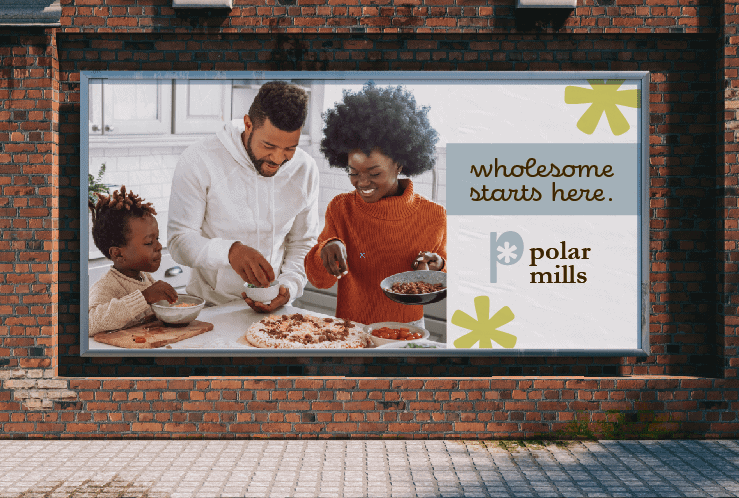
Design Solutions & Agriculture Logo
A big initial is common in food production — think the Kellogg’s K or the General Mills G, so we leaned into that familiarity. Polar Mill’s P is modern, light, and has a fun and symbolic centre. The centre starburst represents both a snowflake, with its six points, and the spokes of a windmill (while the imagery of 4 spokes is more common, 6 spoked mills definitely existed!). In one simple shape, we were able to capture both ‘polar’ and ‘mills’!
The foundation of the colour palette is bright green. A shade sampled right from a polar bean, green represents the environment and all-natural approach of Polar Mills. The muted light blue completes the organic and eco-friendly colour palette. This is also a shade that appeals strongly to Gen-X and Millennials.
Ready to Plan the Branding Seed?
If you’re ready to get your new business growing, book a consultation for your in-depth brand strategy.