Colour plays a crucial role in branding. Consider some of your favourite brands—which colours are associated with them? For instance, Coca-Cola is associated with red, Caterpillar with yellow, Home Depot with orange, and Cadbury with purple. It’s not just the colour that matters, but the exact shade of the colour that makes the difference, and any deviation from the standard can result in confusion and mistrust.
In the world of graphic design, there are several colour codes you can work with. If you’re familiar with Canva, you probably know about HEX codes, but what about Pantone and CMYK?
It’s important to understand that each colour system is best suited to a specific medium. A single colour code doesn’t translate well across different mediums, so it’s essential to use the appropriate one to maintain consistency throughout your brand.
What Is the Best Use for HEX Codes?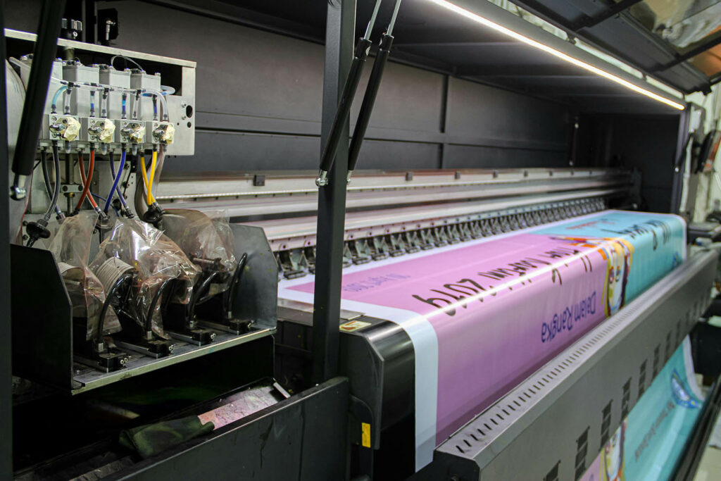
HEX codes are expressed as a six-digit combination of numbers and letters and are the building blocks of your digital design. These are alphanumeric codes that represent a specific colour within the RGB (Red, Green, Blue) colour model. They are used by designers and developers for website designs as they work well on all digital platforms, software, and devices, providing consistency in your brand colours online.
What Is CMYK Colour Code?
CMYK is the preferred colour model for printing. The letters CMYK stand for cyan, magenta, yellow, and key (black). Most printers, including home printers, use CMYK, which usually consists of four separate cartridges–three colours and one black.
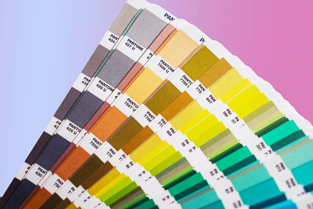
What Is Pantone?
Originating in 1963, Pantone is a leader in colour, with this colour system widely used across the globe. Pantone is relied on for its precision when the exact shade of a colour is crucial to a brand’s identity. For example, Coca-Cola uses Pantone because colour is extremely important to their brand; they require the most precise and accurate colour system to ensure consistency in their branding. Pantone also dictates trends in colour. Their ‘Colour of the Year’ is widely acknowledged as a trendsetting concept for branding, marketing and creative industries as a whole.
Should I Use Pantone or CMYK for Print?
Although both CMYK and Pantone are widely used for print materials, the primary drawback of Pantone is its cost, which is higher than CMYK. On the other hand, CMYK lacks international standardization, meaning different ink producers, such as HP, Epson, Brother, etc., create their own formulations. Consequently, using CMYK printing can be risky for branding purposes. Pantone, despite being more expensive than CMYK, is the best choice when colour accuracy is essential.
Using the Right Colours for Your Brand
Colours have a significant impact on customer perception and influence how customers identify with your brand. When you’re starting out and developing your brand, it’s essential to be intentional with colour schemes to create a logo that stands out and presents your business favourably.
Graphic Design in Calgary
When you work with a graphic designer, they can ensure the right colour codes for both web and print materials to maintain the consistency of your logo across your brand. At Paper Lime Creative, we work with you to create bold brands that will connect you to your ideal customer. If you’re ready to get started on your branding journey, connect with a Calgary graphic designer today!