Here’s How to Keep Your Logo Looking Great
After a month of talking about what branding IS, now it’s time to talk about when you should rebrand, or how you know it’s the right time. Here are five indicators that it’s time to update your business brand.
We’ve covered a lot on the blog in the last couple of months, including What Is Branding?, 4 Indicators It’s Time for You to Rebrand and What the Heck is a Brand Framework? Now we’re going to chat about how NOT to use your logo.
These are some design faux pas that will make your logo and brand less effective. In most of the following cases, it’s the consistency of your logo that is altered. Having consistency in your brand is very important to build recognition. And, having a recognizable brand makes it easier for people to find you and spend money with you!
1) Do not stretch your logo
We’ve put this one first as it is the most common one we see, and can be a really easy mistake to make. The logo needs to be scaled and while it’s getting resized, the proportions are not maintained. Sometimes it’s off a little bit, but we’ve also seen some pretty stretched logos! Often this can be resolved by just holding down the SHIFT key while you’re scaling your logo. This one relates less to brand consistency and more to professionalism. If your logos are stretched funny it gives your design and branding less credibility.
2) Do not change your brand colours
This one IS all about consistency. Brand colours are chosen for a reason — they are used to project emotion to the target audience. If it gets mess with two things happen: number one, a different emotion will be projected to your audience, which might not be the one you want; and number two, you lose out on the brand recognition from your colours. Imagine if Coca-Cola changed their red to an orange?! It would get confused with Orange Crush and people would be wondering what the heck is up with Coca-Cola.
3) Do not change the proportions of your logo
Similar to stretching your logo, this refers to the specific elements within your logo. If you have an icon paired with type, the proportions have been set to create a focal point, hierarchy, and movement in the design. A focal point is what you want people to look at first, hierarchy lets them know what is the most important and creating movement ensures that all elements are read and in the correct order. Changing proportions can shift the focus to a different element and pieces can be missed by the viewer.
4) Make sure the logo has enough contrast
You never know where your brand might end up! Sometimes you don’t get a choice. We find this comes up when our clients are sponsoring events and charities, where they don’t get a say in programs or poster design. Your brand needs to be visible. Having it disappear into the background is the worst! Make sure when you are done the branding process you have an all white logo file and an all black logo file. This will give you the flexibility you need for situations when you don’t have control over where the logo is going.
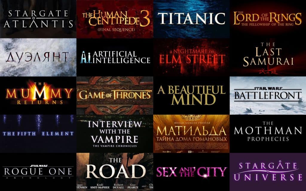
5) Don’t change the font
This is another consistency one like colour. All fonts have connotations to them and graphic designers take the time to find a font that not only looks good for your brand, but also has the right connotations associated with it. For example, while Trajan might look good, it’s been used on EVERY MOVIE POSTER, so it’s become a bit of a joke. When a font gets changed, it wrecks visibility and consistency, and you aren’t sure of the connotations associated with font choice, then you might be giving the wrong impression to your customers!
This is a small sampling of branding sins we’ve seen over the years, but they are the ones we see most often. We hope this helps you navigate your branding better and as always if you ever have any questions do not hesitate to give us a shout.