Colour can be a tricky beast when branding. While most people just see their brand colour, under the surface there is a ton of technical specifications and jargon involved with getting the right colours every single time.
As a graphic designer, I understand what colour space (a term that describes a way to map or identify colour) to use when and where to pull all these magical numbers from that define colours.
That said, I got it wrong for a long time, even after completing my diploma. We spent so much time in the print realm that I am confused by the nuances of web and screen. For a while, I didn’t even think they were that important, wrong!
Now, it’s important for me to educate my clients and business owners who want to have control of their branding in-house on what all these different types of colours are. I understand that budgets are tight and people are trying to do more with less. You shouldn’t have to outsource every tiny piece of design (unless you want to!) to a marketing agency, but it should be consistent.
Colour is the first visual that our brain processes before content or shape. We see a red sign before we see an octagonal sign before we read “STOP”. Many people can identify big brands just from their colour palette.
Having consistent brand colours is incredibly important for visibility, trust and brand recognition. Here is a breakdown of all the different types of colours your brand will need and when to use them.
Pantone Colours for Highly Accurate Printing
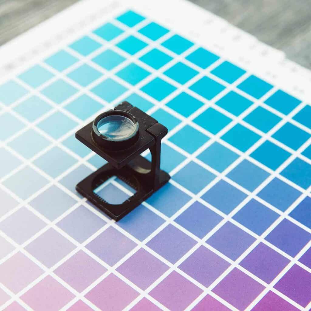
Pantone is a company that essentially has a monopoly on colour-matching worldwide. Pantone 583C (or Paper Lime Creative green!) is the same shade of lime green across the globe. Pantone’s high level of accuracy has made them a leader in colour. You may have looked through one of their swatch books when working with your graphic designer.
Printers use Pantone swatch books to match your brand colours perfectly. Pantone is easiest to match and you can derive all other colour spaces from it. If you grab nothing else in your branding guidelines from your designer, make sure you grab the Pantone number. You can convert other colour spaces from Pantone colours here.
Use Pantone when colour accuracy is more important to you than the cost of printing. Printing in Pantone can be expensive, but if having that immediate recognition is a priority, then printing in Pantone will be worth it for you.
The example I like to give is Coca-Cola. How do consumers know something is a knock-off? Because something isn’t quite right about the product.
If a Coke bottle was the wrong shade of red, you would wonder if it had been tampered with, or if it was truly a Coca-Cola product. When you are building a brand, using accurate colours brings the same trust and recognition to your business’ brand.
Printing in Pantone can be more cost-effective at high volumes, think five thousand and more. Pantone is also dependent on the number of colours. Printing in Pantone is pretty old-school and each colour has its own plate.
Remember potato stamping as a kid? Just like that! The more plates, the more expensive because of the cost to manufacture a big metal plate.
CMYK for Digital Printing
As print designers, we use the CMYK colour space 90% of the time here at Paper Lime Creative.
CMYK stands for cyan, magenta, yellow, and key (Key is black, but called “key” because black was the key colour for alignment). Your home or office printer runs off these four ink or toner colours. Depending on the make of your printer you might purchase these four colours individually. If you look closely at a magazine, you’ll see that it’s made up of tiny dots in these colours.
CMYK is a cost-saver. Printing in Pantone requires a special printer with special plates, which can be costly. If you’re using any photography, it’s downright cost-prohibitive to be printing in Pantones because you would need to make a lot of different plates!
Day-to-day printing is done with a digital printer using CMYK – this includes your printing at Staples or your local print shops like UPS or Minuteman.
Digital printing is improving to match Pantone colours so it can provide the brand accuracy you’re after. However, there can still be colour discrepancies. Talk to your printer or designer about colour matching and your best options before you go to print!
The format you will see for CMYK is a 4-number code showing the percentages of each ink. For example, C=33, M=12, Y=100, and K=0 is Paper Lime green
RGB & Hexadecimal for Screens
RGB stands for red, green, and blue. When you layer different levels of red, green, and blue light, it can create different colours. Because RGB is dealing with light, it’s the colour space used for digital screens. Hexadecimal is a six-digit code used for screen colours on websites only.
Important things to know about RGB colour
- The colours available in RGB can be more vibrant than in CMYK.
Do you remember MS Paint? There were super vibrant neon colours at the bottom. Those are great examples of RGB colours that don’t translate easily to print.
Again, it’s essential to start with Pantone and derive other colours from the Pantone to make sure you have accuracy across platforms. That way, what you see can truly be what you get.
- RGB is device-dependent
Every screen is programmed a little differently. The way you view a specific RGB value on your computer may vary from how it appears on your phone or your co-worker’s screen. If it’s important to you, you can look into colour management for your system to get accuracy between your computer and scanner/printer. But, you can’t control how people view your branding on their screen.
When should you use it? Any time you’re doing something online. If you’re uploading your logo to social media, the RGB logo is the one you’re looking for!
You may have seen CMYK logos uploaded to Facebook in the past, and they will not look right. You’ll just know. They’ll be all neon and glowing, and just look plain weird.
Ready for a Colourful Brand Identity?
If you’re looking for an update to your brand with colours that will grab your target audience’s attention, then you’re in the right place. We will guide you through our proven brand development strategy to create the best visuals and brand messaging for your target market.
Book a consultation call with us today!
