But the House Logo Just Makes Sense, Right?
Long story short, you should avoid literal logo design because it doesn’t work!
Let’s rewind a bit. What do we mean by literal logo design? A literal logo design is when your logo matches the product you sell. For example, you’re a computer company and therefore your logo is a computer. You are a burger joint, therefore your logo is a burger. You get the idea.
This is often the go-to for new entrepreneurs, Canva users and quick and dirty logo designers that you may find on Fiverr. It stems from a few issues including lack of budget or lack of time. Literal logo designs exist because the right people aren’t given the right amount of time to think outside the box and make unique choices.
If a logo explains what you do, why on earth wouldn’t it work? Here are the problems that come with being too literal in your logo design:
No differentiation
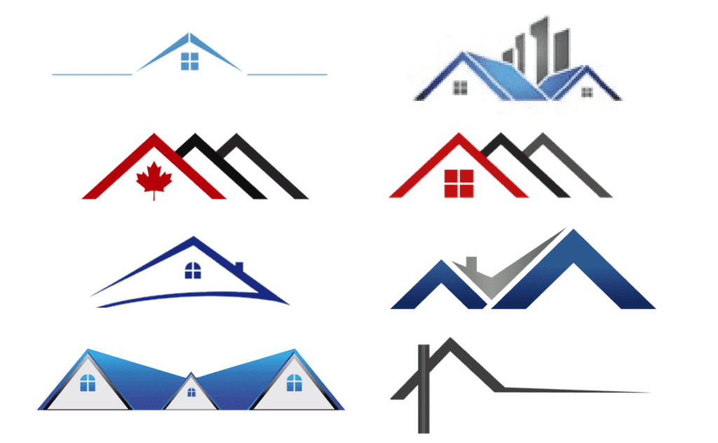
Actually less than none, literal logo design can actually lead to confusion! A realtor with a house logo, a mortgage broker with a house logo, a roofer with a house logo, a handyman with a house logo. How on earth do you tell them apart? Then add the fact that multiple realtors and multiple mortgage brokers, etc use a house as their logo and it can get confusing really quickly.
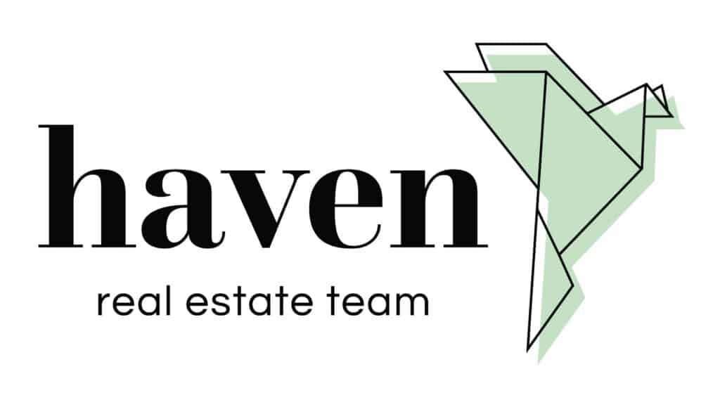
Instead: Base your logo on an emotion, value, or something symbolic about your process or procedure. We did this amazing dove logo for Haven Real Estate because they wanted to create a sense of peace.
Limits your business long term
What if Apple had chosen a computer logo? They would’ve been known as a computer company; it’s what got them their start after all. But the product that really skyrocketed them to mainstream success? The iPod.
Now there are phones, watches, tablets, earbuds and televisions as part of their product offering. If they limited themselves to being a computer company instead of a tech company, they would be pigeonholed into doing what they had always done with only a small portion of the personal computer market share.
Instead: Pick something abstract and simple that is easy to use on multiple applications. Having something abstract or out of the left-field (like an Apple!) shows off your company’s personality and makes them unique in the market.
Your logo is an identifier
While this ties in with our first point, it’s important to reiterate. Your logo is not meant to explain what you do, that heavy lifting is meant for the bigger brand. Your logo is meant to identify you quickly, in a sea of competitors, and to be memorable. This is also a huge reason why overly complicated logos are detrimental to your business as well.
Instead: Don’t try to cram every ounce of meaning and information into your logo. That’s the job of the bigger brand. Come up with appealing secondary graphics, messaging, or even audio to give your customers a fuller brand experience.
Need professional help?
Are you struggling to think outside the box with what your logo could be? Does it feel like it would just be easier to create that house logo? This is where professional graphic designers and brand strategists come in. It is their job to do the research, figure out your ideal customer, and create that easily identifiable logo that will resonate with your business for years to come.
Book a consultation call with us today to see how we can help!