The Client
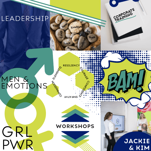
ElementQ is an Emotional Intelligence education company — the first of its kind in Edmonton, Alberta. The owners, Jackie & Kim work to create a safe space to learn, discuss and grow our Emotional Intelligence. They have a broad target market, with programming for men, women, children, medical professionals and more. It was important that we gave them an approachable and science-based logo to provide community and credibility.
Designing for a broad target audience can be a challenge. The colours and elements that attract a 55-year-old man are vastly different from what appeals to a 10-year-old girl. Often, business owners haven’t distilled down their ideal customer, but in the case of ElementQ, they really can help all ages.
The Design
We were inspired by science and popular brands that go beyond age and gender. Bill Nye the Science Guy, Popular Mechanics and others. Emotional intelligence is ‘the missing element’ in our education. We learn common sense, we get traditional education in school, but rarely do we learn about our emotions. We don’t know how to identify them or, more importantly, know what to do about them.
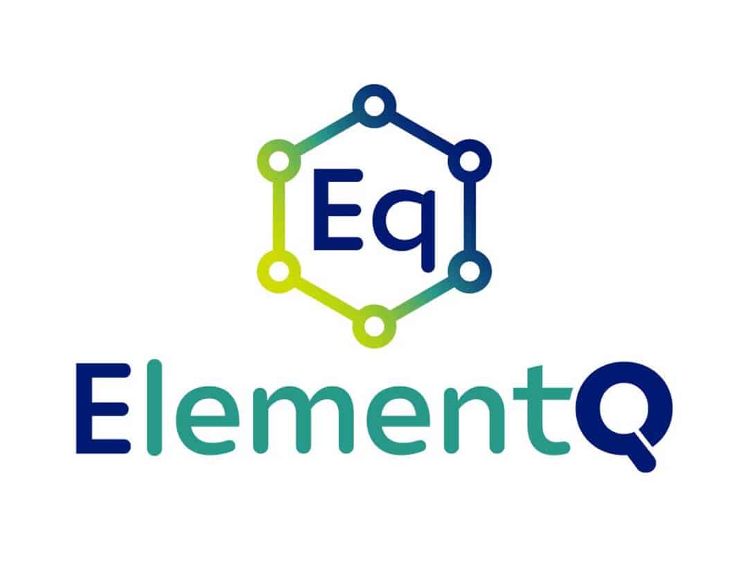
The icon is reminiscent of the periodic table of elements – we’ve created a new one for EQ! In the name, the E and Q are in dark blue to make the connection between Emotional Intelligence and the new brand name.
We carefully chose colours, as all colours have emotional connotations. The dark blue is professional and grounding. Green is the most relaxing colour and the yellow is happy and energizing. The result is a brand that transcends age and gender and gets to the core value of ElementQ – teaching people about their emotions.
