
The Client
Tidy Katie is a professional organizing business owned by Katie Hudson. She is registered with the Professional Organizers of Canada and prides herself in her unique approach to organizing. Katie’s background is in Drama, holding a Fine Arts degree from the University of Alberta.
While many organizers can feel rigid in their approach, Katie brings a level of creativity to her professional organizing. She gets your home looking and feeling great with an outside-of-the-box and compassionate process. Katie focuses first on practical organization but also loves creating aesthetic solutions for her clients.
The results of her process are outstanding — creative solutions to daunting problems. Katie has many packages to fit the needs of anyone needing help with their organization. She can tackle any project, whether it is a single closet in a bedroom or your entire house.
The Design
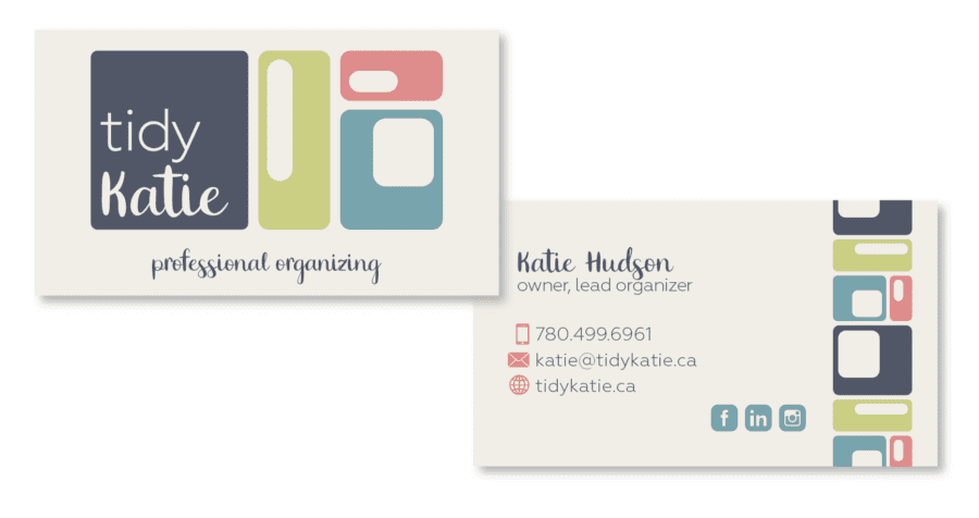
The Tidy Katie professional organizer logo was inspired by Scandinavian Minimalism, a look that was made popular by homeware giant Ikea. This style blends modern minimalism with vintage patterns. The result is a creative, yet structured brand that reflects Katie’s approach to organization.
The brand is targetted to a demographic slightly older than Katie’s as her typical clients are Baby Boomers and Gen X. This makes the slightly vintage look nostalgic to her older clients, but still familiar to younger clients. The brand bridges the age gap between Katie and her clients because it doesn’t feel too mature for someone in their thirties.
We stayed away from the typical tropes of the professional organizing industry which are mostly houses, hangers and puzzle pieces. The solution is an abstract brand that stands out in a small industry and is flexible enough for multiple applications.
The Results
“Katie created a logo that captured a piece of me I wasn’t even aware I was bringing to my clients. It brings out my creative and fun side. Once I embraced that I found that I felt more confident in what I had to offer as well as the ability to identify my target audience better.The process was easy and fun, Katie is amazing to work with.The changes in my business have been tangible. My branding gave me the confidence to really own the specific type of client I was wanting to help.I have received feedback from clients that my brand reflects my style and personality which is exactly what I could hope for in a brand where I work one-on-one with people in their homes. “– Katie Hudson, Tidy Katie