What do the powerful have that the weak don’t?
Money?
Fame?
Good looks?
Nope! The answer is much more complex.
Powerful people and groups have a voice.
And how do you create your voice and express yourself? Through art, of course!
The LGBTQ+ community is the perfect example of a community that has built a powerful voice through art. That’s one of the main reasons queer art has had such an impact on art, design, and branding.
Why Do We Love Queer Design at Paper Lime Creative?
This is an easy question to answer. Aside from the fact that it’s colourful, eye-catching, and deeply meaningful, queer art is the epitome of Paper Lime Creative’s values. The four I’s behind queer design are always involved in our creative processes.
The Four I’s of LGBTQ+ Art
Inclusivity
Art has brought people together for centuries, but even art can be exclusionary (and has been, historically). As a kid, how many films featured gay or lesbian couples? How many transgender actors (aside from Laverne Cox) do you see on the big screen? How many times was bisexuality the focal point of a romance novel you read?
You see where I’m going with this. LGBTQ+ design is moving toward a more inclusive representation of society in all forms of art. It’s based on the belief that our individuality can be celebrated and accepted in all forms.
Identity
Like all art and graphic design, identity is critically important in LGBTQ+. But for these communities, identity is the central theme around which all design elements revolve.
“Loud” is often the name of the game, and it’s easy to see why. When your identity has been repressed collectively for centuries (and individually for as long as it took to come out – and in many ways well beyond that date), you need to shout it from the rooftops! Bright, punchy, and highly recognizable designs are there to remind people that yes, we are here and we are amazing.
Inspiration
Graphic design is about grabbing attention, yes, but that’s only the first step. After that, you need to get people to DOsomething. If there is any group that knows how to inspire action through art, it is the LGBTQ+ community. Their art bands people together, creates social and political change, and makes sure everyone has a hell of a lot of fun while doing it! Not only is it inspiring for their community and supporters, but it’s also inspiring for graphic designers and marketers, so take note, ladies and gentlemen!
Innovation
Although it was a gamechanger for the LGBTQ+ community, queer art is far more than just the recognizable rainbow flag (the history of which you can learn more about below). There’s a lengthy history of queer art, and although it’s always adapting to the times, it never submits or conforms.
Numerous artists have contributed to the vibrant patchwork quilt that makes up queer design. Let’s dive into some of the history and innovation over the past century (and beyond!)

The Colourful History of the Rainbow Flag
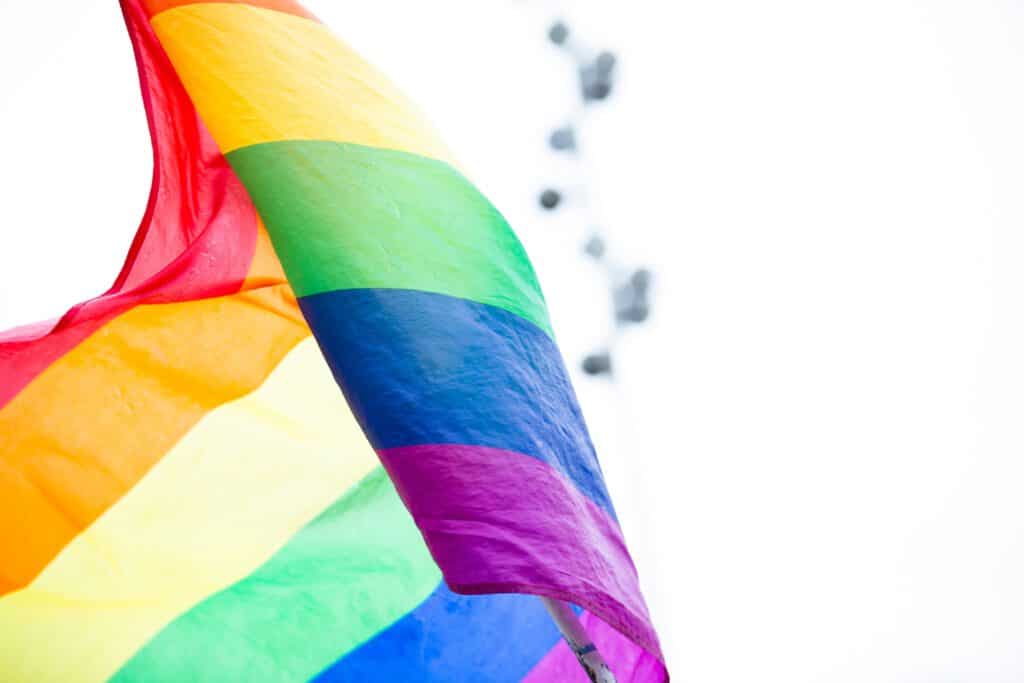
First, let’s talk about that iconic symbol for the LGBTQ+ community: the rainbow flag.
It was originally created as an eight-colour flag in 1978 by San Francisco based artist Gilbert Baker. At that time, San Francisco was on the cusp of its gay awakening. When Baker designed it, it symbolized the gay community, but since then, it’s grown to include the greater LGBTQ+ community and has changed in style, often slimmed down to include just six colours. However, in Baker’s original version, each colour represents a meaning, ranging from sex (pink) to harmony (blue). We love this, because if you know anything about Paper Lime Creative, it’s that we’re passionate about colour!
Baker actually sewed the original 30’ by 60’ flag by hand. He was talented when it came to sewing, also putting together fabulous drag outfits to wear to protests and celebrations (another community that has influenced graphic design).
Before his death in 2017, he told CNN that he designed the flag to express the gay community’s joy, beauty, and power. He chose a symbol of nature purposefully, and has also expressed that the never-ending arc of the rainbow represents the unfinished gay movement.
You’ll recognize the symbol emblazoned proudly across the streets on Whyte Ave in Edmonton, where it’s used as a crosswalk that symbolizes safety and inclusivity for all people.

Other LGBTQ+ Symbols You Might (Or Might Not) Recognize
The pink triangle was forced onto gay prisoners in Nazi concentration camps. The gay community has reclaimed the pink triangle, fittingly used to advertise gay-friendly events and activities.
Pulp fiction books were cheaply made magazines and books that were printed on pulp paper. In the 50s and 60s, gay pulp art was featured on the front of many of these.
In 1970, graphic designer Tom Doerr chose the Greek lambda as the symbol for the gay liberation movement, which was universally accepted as the symbol for gay rights worldwide. It’s fitting, considering that many Greek statues and artwork featured gay art that ranged from gentle to downright lusty.
Past & Present Artists from the LGBTQ+ Community
Many famous and renowned heroes of history were LGBTQ+. It’s less than surprising that many of them chose not to reveal their deeply held identities to a wider public that would turn up their noses at best and punish them severely at worst. Leonardo da Vinci, Florence Nightingale, and Alan Turing are just a few of the historic game-changers who didn’t conform to the norms of the time.
Maybe lesser known are the many artists and graphic designers who have inspired change, not only in queer design, but design in general. We’ve mentioned a few already, but here are a few more to read up on:

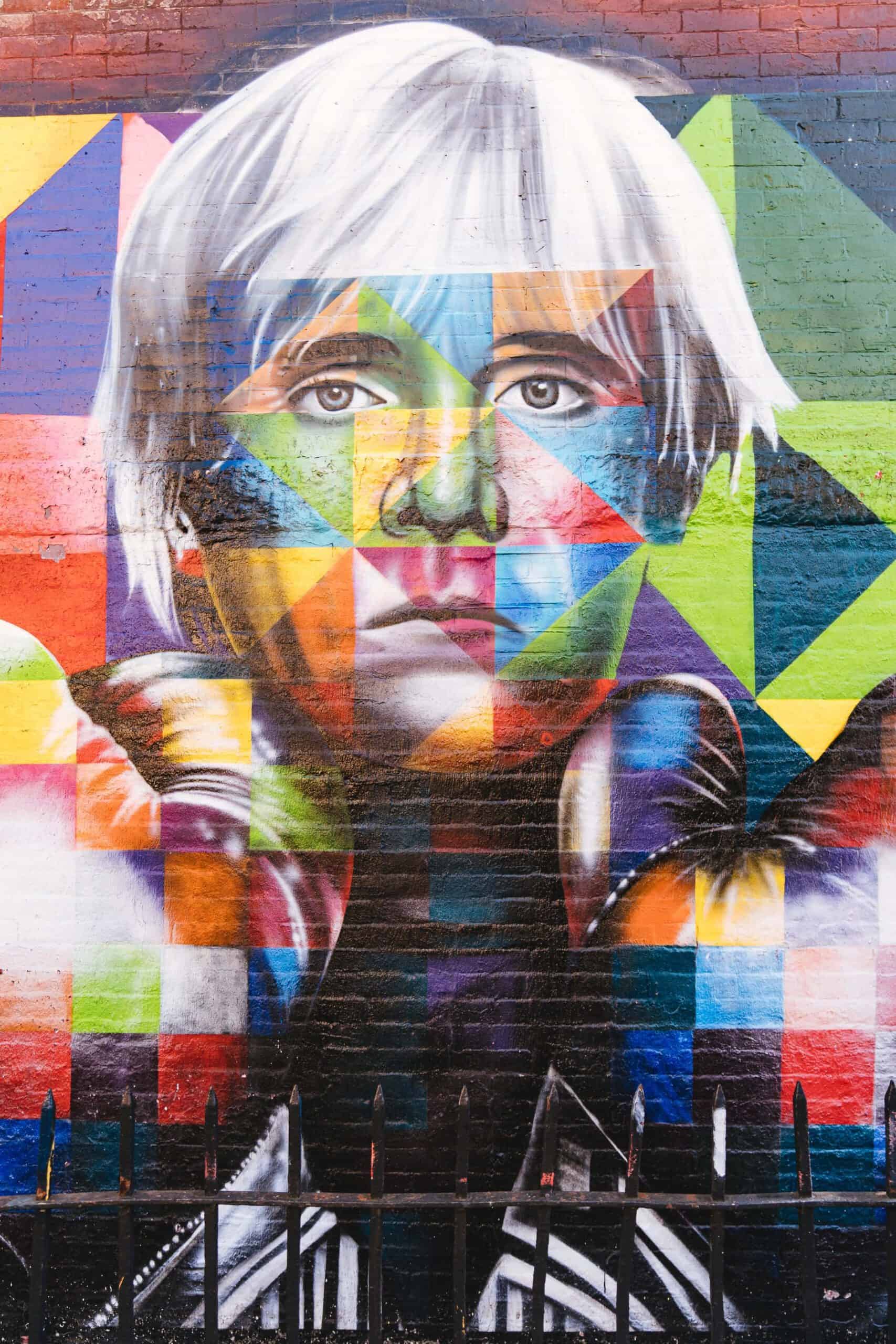
Andy Warhol
Let’s start with the most obvious – Andy Warhol. He was openly gay, and his work in music, film, and graphic design was, in a word, glamourous. Although many of the images you know him for wouldn’t be interpreted as queer art (like the Campbell soup cans), he did like to produce erotic work that was focused on gay culture.
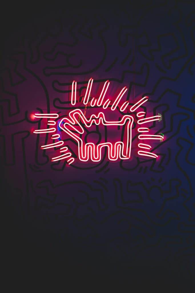
Keith Haring
Made famous in the subways of New York and eventually commercialized to a wider audience, Keith Haring was known for bringing gay art and AIDS awareness to the forefront in the 80s.
Liz Nania
In 1987, bisexual artist Liz Nania created the biangles, a simple but powerful symbol representing complete inclusivity. She started with the pink triangle used by Nazi’s, building a blue triangle that overlapped.
Learn More About Our Creative Processes
Now that you’ve had a little history lesson on how the LGBTQ+ community has influenced art and design (and us!), head over to our design process page to see how some of this works in. Or better yet, pick up the phone and call us! We’d be happy to talk about art, design, branding, or pretty much anything else interesting and awesome.
