Timeless or Trendy?
Timelessness is defined as “the quality of not changing as fashions change”. This is a pretty lofty goal, especially when we don’t really know what direction style and design will go. While there are some very smart people who make predictions, in this digital age we never truly know what’s going to take. There is more diversity than ever before, so does timelessness even truly exist?
The Timelessness Challenge
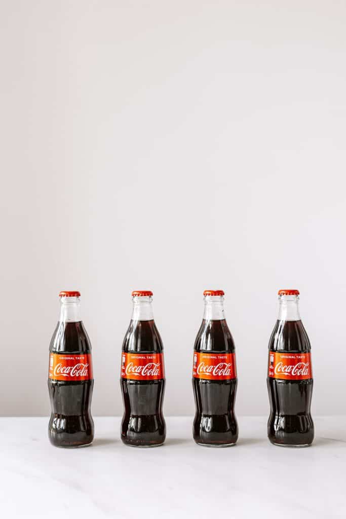
Does timelessness exist? Well, it depends. If you asked Coca-Cola, which has had the same logo for 125 years they would probably say that timelessness exists and that they are, in fact timeless.
Though some people would argue no, even to a 125-year-old logo. Advertising, marketing and branding are still baby industries. Are 125 years enough to declare something as timeless? Maybe “longevity” is a better term.
Steps to Build Your Timeless Brand
Staying away from trends is the first step in creating something timeless. Trends are temporary and fleeting. They’re also really cool because they can define a generation or zeitgeist, but they sure don’t last long. Think about 80s neon and big hair, the 90s with belly shirts and no bras, or the 60s with hippies and the Summer of Love.
These are iconic trends that influenced fashion, design, music and more, but whether you love them or not, they’re dated. It’s crazy to think that the Coca-Cola logo has survived through all of that!
If you are building your company’s brand be very critical of whether your choices are based on a trend or not. If you see the same font everywhere or the same colour, chances are it’s a trend in graphic design. Design choices should be made based on who your client is, not what’s “in” right now.
This can be scary for businesses. Chances are, if you’re not following the trends then you’re going to be doing something out-of-the-box, which is inherently risky. But because you’re not following the trends of others, it won’t get date stamped like everyone else. You become a trend-setter instead of a trend follower.
Timelessness Best Practices
There are some tangible practices that can help with longevity. Keep your logo as simple as possible. Embellishments come with an expiry date!
Remember cars from the 1950s with the wings? These were embellishments to make vehicles look futuristic. Now, they look old! Google a 2010 Hyundai Elantra vs the 2020 model. There are definitely some body-line changes, but it’s not nearly as dramatic. It’s getting harder to tell whether someone has a 2-year-old car or a 10-year-old car.
Whereas furniture giant IKEA has, for the most part, opted for clean lines. Some of their furniture pieces haven’t changed in decades and are still popular today.
With simplicity comes adaptability. The simpler the design, the easier it is to update with the times. The original Coca-Cola logo definitely didn’t come in a digital format, but it’s simple and elegant enough that it would be very easy to create digitally.
Same with the McDonald’s golden arch. The original vision is still there which means your brand doesn’t lose exposure or visibility over time. McDonald’s has been able to put its logo on merchandise, packaging and clothing, reinforcing the familiarity of the brand with customers.
If your logo is simple and adaptable, it will last longer. While I would love every company’s logo to be beautifully designed, sometimes it’s more important to get your logo out there. The ones that get used the most and the longest are the ones that get established. Once you’re established, you create longevity, and dare I say, timelessness?
Looking for Your Own Timeless Brand?
If you’re ready to build a brand then it’s time to book your consultation call with us today!
