Older adults need great branding, too
We love branding for older adults! There are so many interesting considerations to make! Our eyes change drastically as we age, as do cultural references! If your target audience is older adults here are some great tips for you.
Larger open fonts
Things just get harder to read as we get older. After spending a decade working behind a computer, Katie is getting more and more nearsighted every year! Body copy for your average brochures or magazines is about 10 points. Most people are surprised by this because the computer default is 12, but, unless you’re an older adult, 12 is actually a very large font size. 12-14 points is a great starting point for large chunks of content for your older adult audience.
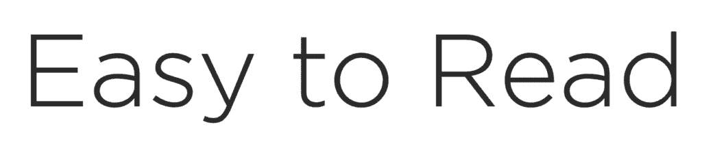

When we say “open” fonts, we mean fonts that feel like they have a lot of space. The individual characters are taller and wider, often with more space in between them so that each letter is distinct and easy to read. Gotham, Century Gothic and Helvetica are all excellent examples of this.
Closed or compressed fonts are harder to read because their individual characters can blend together. Script fonts, especially modern ones, can be difficult for this as well as anything that is too compressed or stylized.
Avoid blue and other cool colours
Blues, greens and purples become tougher to identify as our eyes age. The outer membrane of your eye (the sclera) begins to yellow as we age, when you mix cool colours with yellow, they start to muddy, lose contrast and become hard to differentiate.
Reds, oranges and black are great colours for older eyes because the yellowing of the sclera is less of a problem. These are also high contrast on white (and red and orange are high contrast on black), making graphics easier to read and understand.

Use the right language
Language changes fast! The team here at Paper Lime Creative is in our 30s and boy, it’s hard to understand what a 15-year-old is saying these days!
Always avoid jargon, whatever your target market, but be especially mindful if you’re targeting older adults. If a language has changed this much in a decade, imagine what it’s like for them if you are 2-3 decades younger than they are. Keep messaging simple and to the point. There is no need for fluffy marketing promises with this demographic.
Use physical marketing materials
Depending on the age group you are targeting, social media can be hit or miss with older adults. While the ones that are on social media are on Facebook, some are not on social media at all (Katie’s mom doesn’t even have an email address!)
Always include some sort of physical material with this target market. Maybe you leave them something after a meeting, advertise in your local newspaper, or send mail-outs. Whether you are actively promoting on social media and your website or not, always flesh out your efforts with a print product.
Want to capture this under-serviced market?
Older adults are a phenomenal group to target, but they are often overlooked. They still have huge purchasing power and decision-making ability. Even if older adults are a small portion of your audience, book a consultation call with us today to learn how to update your brand for this demographic.